Hello everyone; Coach Tyler here.
Today I want to talk about something a little different. It’s certainly something that, as a personal trainer, you might never have even thought of. And that’s getting yourself a unique logo for your business.
And it has to be something that stands out and defines your brand. Something a client will see for the first time and remember in the future.
As a personal trainer, establishing your own unique brand can go a long way to set you apart from the rest of the crowd.
I also highly recommend that you take the quiz and find out which certification is best for your career goals.
You want to stand out, be noticed, and attract prospective clients. Sometimes, it’s not enough to have the perfect website, great social media content, and a long list of accreditations.
In this blog post, we are going to look into several aspects, including:
- Effective logo design tips
- Examples of good and bad logo design
- Where to have your logo designed
So take your time to read through this post, and as always, I encourage you to leave me a comment should you have any questions. I will get back to you as soon as possible.
Effective Logo Design: What You Need To Consider
Let me start by saying that although I am certainly no graphic artist, I have done enough research and read many articles about building my business and the important aspects one needs to consider.
From those, I have drawn up a few points that you should consider when it comes to designing a logo that will represent your personal training brand. So let’s take a look.
Understand your brand and what you want to convey through your logo

While this might be a far more important step in big business, it still applies to us as personal trainers. We know our brand, what it is we do, and how we operate in the fitness world. But that doesn’t mean a logo can be anything you want it to be.
Your logo should speak for you when you can’t. It should be about reaching your potential target market and should always be simple to understand. In this way, it helps to convey what it is you do. And while that might all sound simple enough, sometimes conveying all that information in a logo isn’t easy.
As a personal trainer, however, the most important thing to get across through your logo is what you do or offer. And if you specialize in a certain niche and include that in your logo, do so!
Your logo should make an impression.
A logo is one of the most important parts of your brand and it should certainly be able to make an impression, especially on prospective customers. The best way to do this is with a unique design.
But be warned, don’t fall into the trap of an over-elaborate logo that might seem understandable to you but mean nothing to the general public. While you want your logo to stand out from the crowd, you don’t achieve this with outlandish design, wacky colors, or unreadable fonts.
Exclusive PTP CPT Offers |
||
|---|---|---|
Best Overall Cert | Best Online Cert | Best Study Materials |
Gold Standard Cert | A Good Option | Best CPT for you?  |
Colors can convey a message.
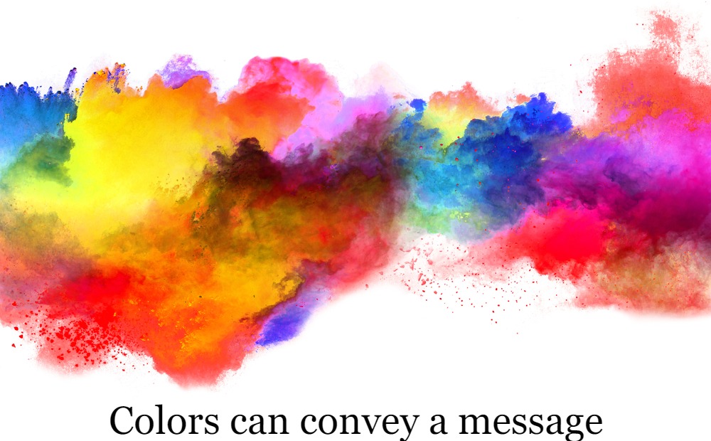
Although we touched on colors in the point above, it’s important to realize just how much of an influence they have. For example, research on the subject of colors shows that red conveys passion, energy, and even aggression, while blue indicates trust, reliability, and security.
It’s important to have this in mind when selecting logo colors, that’s for sure. You want something that will convey the necessary meaning you need your brand to portray and it must stand out from the crowd as well.
For more information about the use of colors in your logo, I suggest you read this excellent article from Business Insider.
Choose the right fonts.
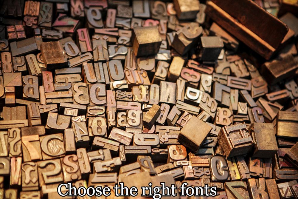
If your logo incorporates fonts, you must ensure that the ones you pick work. It’s amazing how many people, when starting out their business go with anything regarding the fonts they use.
The golden rule here is that it should always be easy to read. You might think that gimmicky font looks fun and whimsical, but if it’s not easy to read, then what is the point?
And your font should fall in with your brand identity.
Determine the type of logo you want
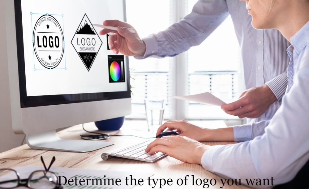
One of the hardest things to do when it comes to deciding on a logo is to determine the type of logo you want to use.
Will you use a symbol, a letter, a name, or a combination of these options? There are endless possibilities when it comes to deciding on the type of logo you are going to use.
Often, your decision might be based on the name of your business. As an example, technology giant Apple had it pretty easy when they needed to come up with a logo, right?
The most important thing to remember when choosing your type of logo is to keep it as clean in design and as simple as possible and not use more than two colors. In fact, reproducing your logo will cost less if you can stick to one color.
Does it work in varying sizes?
Your logo is going to be used in many different ways. It will appear
- In your social media feeds
- On your business card
- Your corporate stationery includes letterheads, client questionnaires, handouts, and more.
- In advertising
- On promotional material
And for that reason, you need to ensure that your logo can be increased or decreased in scale and still work effectively. For example, a too-busy logo will look horrendous when made smaller and placed on a business card.
You must also ask yourself whether the logo works in black and white.
Why?
Well, it’s not going to appear in color all the time. Consider a newspaper advert, fax, or perhaps promotional items – all will see your logo in black and white.
That’s why a clean, simple design is the most effective.
The good and bad of fitness logo design
While this might be subjective, I will show you some of what I consider good and bad logo design.
These work…
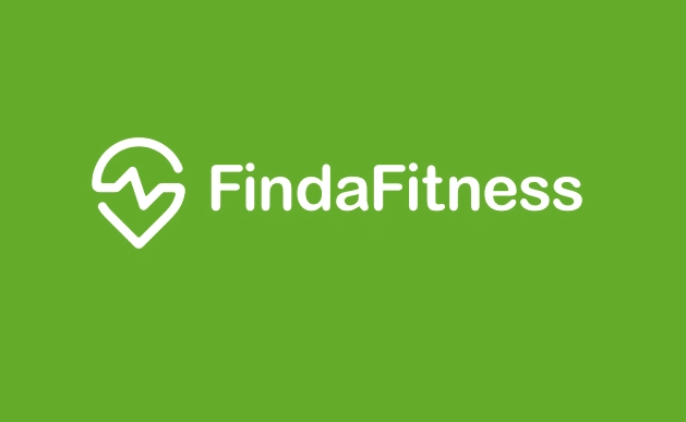
For me, this is a great example of a clean logo incorporating a design and a name. Thanks to the word “fitness” and the heartbeat that forms part of the logo design, it’s easy to see the overall message the logo is conveying.
While it’s white on a green background, this logo can easily be reproduced in black and white. It’s simple, clean, and crisp.
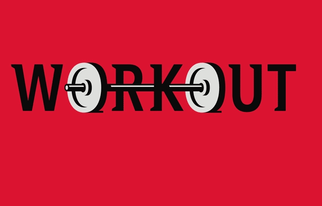
This logo incorporates the weights into the name and is a clever design. If I were to change something with this logo, it would be the font. It could be a little clearer and crisper and without the serifs on the top and bottom of the letters.

I like this logo because it is clean, simple, and to the point, yet it also conveys a message. It’s also easy to replicate across various media and will work in black and white as well. The picture also conveys a strong message that ties in well with the company’s name.
These don’t…
Now let’s take a look at a few logos that, in my opinion, don’t work. And I will explain my reasoning for why they don’t.
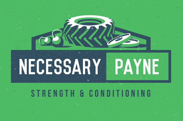
While I love the play on words and use of what is obviously this personal trainer’s surname, in my opinion, this logo is too busy. In fact, I think it could work without the gym equipment above the name.
This logo will also be hard to replicate across various media and will not work at all if you have to scale it down to a small size. It is just too busy.
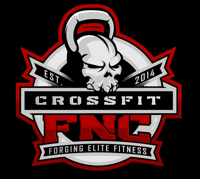
While it is interesting, this logo doesn’t work. Not only is it too busy, but I am not too sure why the kettlebell needs to look like a skull. The main problems with this logo are the use of multiple fonts, the fact that it won’t be easily scalable, and it won’t work in just one color.
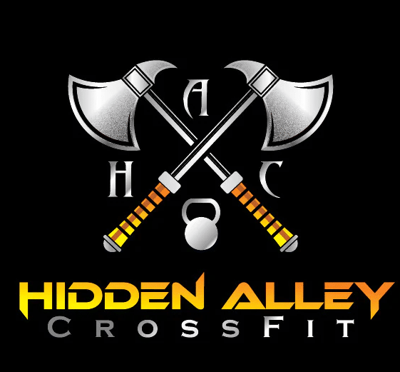
While a pair of axes have nothing to do with cross-fit, this logo also has other problems. It not only uses multiple font types that are not the easiest to read, but it’s not necessary to include the abbreviation of the company name when it is already present. Again, scalability and reproducing it in a single color will cause problems.
Where to get your logo designed?
Unless you are a graphic artist, the chance of you actually doing the final design of your logo is slim.
Sure, you can come up with the concept but in reality, you are better off than passing that on to a competent graphic designer who will produce a logo based on your overall vision.
And the easiest way to do this is to use one of the many online platforms where you can find a freelancer. Let’s take a look at a few options that you have.
Upwork
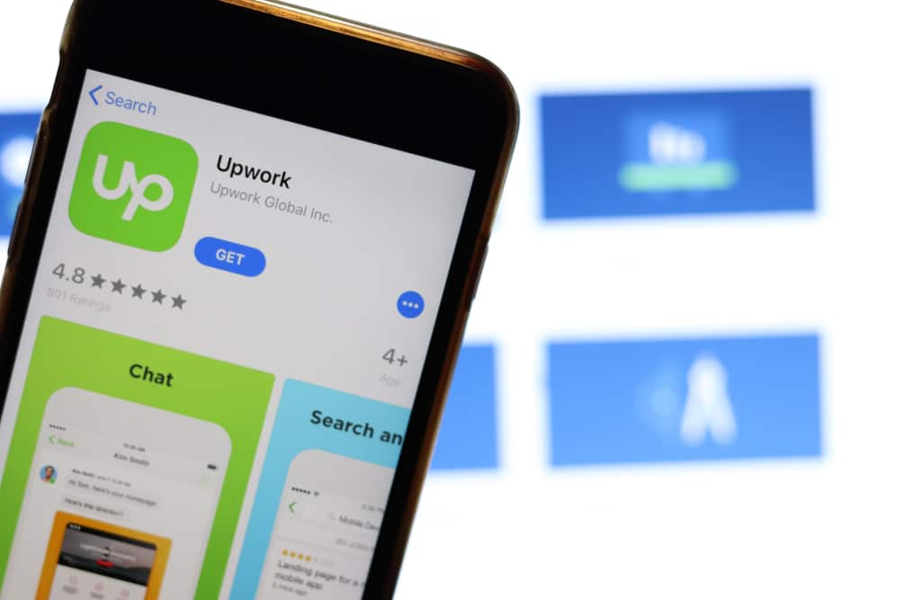
One of the biggest freelance portals on the internet today, finding a freelancer on Upwork is pretty simple.
You will need to first create a company profile for your personal training business, and from there, you can post any number of jobs. Setting them up is easy and allows you to provide prospective graphic artists with all the information they need to design a logo for you.
Note, however, that you must assign a budget to each job and pay an amount before the job listing is posted on Upwork. Once the listing is posted, freelancers can apply for each posting. This allows you to review all your options and find the one that best fits your requirements.
The best thing about Upwork is the fact that you can see the profiles of all the freelancers who apply to design your logo, as well as client reviews on jobs they have completed before.
Once you assign them to design your logo, Upwork has a messaging system with video calling, an hourly timekeeper (if you opt for a per-hour pay structure), and a host of other tools at your disposal to ensure the job runs smoothly.
Once you are happy with their work, a simple click of the button will see them paid and you can leave a review.
Fiverr
Fiverr is another freelance portal that you can use to find a graphic design freelancer to help bring your logo design to life. It works a little differently from Upwork, however.
Instead of posting your specific job needs, you will browse through freelancers who are offering gigs in a category you search in, for example, logo design.
This will bring up a host of graphic design freelancers and what it is they offer per gig – the name of a job in Fiverr – and at what price. It’s important to take your time and read through each gig to ensure the graphic designer performs exactly what you need to be done.
Why? Well, with Fiverr, you don’t write the gig description; the freelancer does. And that’s why you have to ensure that what they say they will do will cover your specific needs regarding logo design.
Guru
The final freelance portal I want to look at is Guru. This works in much the same way as Upwork.
Once you have signed up for Guru, you can post your job online. This makes it available to thousands of freelancers who can then bid on the job. Again, much like Upwork, you can go through each one of them to find the person you think best suited to the job.
You can also browse through freelancers in different categories, for example, graphic design, and approach them to apply for your job. Once you have found someone you like, you can sign them up as per the terms outlined in your job description.
While Fiverr is a great platform, I think Upwork or Guru are better options because they put you in full control regarding the job posting itself. This allows you to outline fully what you want to be done, what you expect in the final product, and what you are prepared to pay at the end of the day.
Producing your own logo

Suppose you are starting out as a personal trainer. In that case, you might not have the additional capital resources to use a service like Upwork, Guru, or Fiverr to find a graphic designer to produce your logo.
You could consider doing it yourself if you have a way with design. And several online platforms can help you. One of these is Placeit.
While you might find something you like on a platform like this, many of the logos here are too busy. Remember what we have already discussed about your logo: clean and simple, easy to scale and replicate in black and white.
Final words…

Thanks for taking the time to read through my blog post about personal trainer logos. They certainly are something that you should take very seriously and that’s because they will form a very important part of your brand.
And while they are important, if you are starting out as a personal trainer, don’t force or rush into just accepting the first design you see or that comes into your mind.
Take your time, do your research, look online for ideas, and come up with something simple, easy on the eye, can be reproduced easily, and conveys your brand in a positive light.
As always, if you have any questions about this post, please don’t hesitate to leave me a comment below.
References
- “Powerful Tips for Effective Logo Design.” Designhill, https://www.designhill.com/design-blog/powerful-tips-for-effective-logo-design/.
- “Fitness Logo Design – 30 Really Inspiring Fitness Brand Logos.” Design Your Way, https://www.designyourway.net/blog/graphic-design/fitness-logo-design/.
- “Tips to Create Your Fitness Gym Logo.” Placeit Blog, https://blog.placeit.net/tips-to-create-your-fitness-gym-logo/.
- “The Top 15 Fitness Logos for 2021.” Origym Personal Trainer Courses, https://origympersonaltrainercourses.co.uk/blog/fitness-logos.
- “Personal Trainer Logo: How to Make Your Brand Stand Out.” Trainer Essentials, https://www.traineressentials.com/personal-trainer-logo/.
- “Placeit.” Placeit, https://placeit.net/.

 Have a question?


Tyler Read
PTPioneer Editorial Integrity
All content published on PTPioneer is checked and reviewed extensively by our staff of experienced personal trainers, nutrition coaches, and other Fitness Experts. This is to make sure that the content you are reading is fact-checked for accuracy, contains up-to-date information, and is relevant. We only add trustworthy citations that you can find at the bottom of each article. You can read more about our editorial integrity here.